Thursday 29 April 2010

Evaluation - Abi Black

For our final piece our group has made a short social realist film, focusing particularly along the storyline of a broken family, one of the key conventions to British social realist films.
In pre-production research we found that British Social Realist films follow a similar structure in their conventions, helping them to be placed into this genre. British Social Realism films first became popular after WWI where it was discovered that the “key” to national cinema was found in realism and the seriousness they conveyed, becoming current themes associated with the genre today. Other notable conventions were mainly relying on diegetic sounds, using natural lighting, mainly focusing on the working class, and using as many “normal” props and settings as possible to convey the realism.

In what ways does my media product use, develop or challenge forms and conventions of real media products?
• When first looking in to social realism, one of the first films I looked at independently was “London to Brighton” a modern social realism film directed by Paul Andrew Williams. One of the key things I noticed in this film which directly related it to social realism was the actual theme. Addressing the issue of drugs, prostitutes, and homeless children.
• Having looked at this film combined with others such as Happy Go Lucky (Mike Leigh)/http://www.imdb.com/title/tt1045670/ and Wasp (Andrea Arnold) http://www.imdb.com/title/tt0388534/ there seemed to be a pattern in which the themes all conformed to, they all dealt with “harsh” topics and did not try to glamorize it.
• Another convention noted in all the films above were the fact that they were all representing working-class people, and not middle-class. For example this was instantly noted in Happy Go Lucky where we are introduced to this young care free teacher, sharing a flat with her best friend in North London. In Wasp it was much more obvious as we are shown an establishing shot of the council estate of which a single mother with 4 children is living in.
• In our film we decided to break this convention of social realism, and chose to use a middle-class family, although not struggling financially, still breaking up as a family unit and trying to cope with an alcoholic/abusive father. This I felt worked quite well as I still think people can connect and empathise with our main character Milo, regardless of the fact he is from a middle-class background.
• The colour we found in most of these social realist films seemed to be desaturated, which fits in with the genre and helped to match the themes presented, giving them a gritty feel and reinforced the despair of our central character. Here is a still from our film having used the desaturated colour. Here is an example of a still from our film showing the effect of the desaturated colour.
• Following on from the use of colour another typical convention for the genre is relying on the use of natural lighting, which we managed to do throughout our film. However for the scene in the bedroom where we needed it to be quite dark we had to use artificial lighting. The effect of having the natural lighting helped to support the fact that this film is based on reality, and we didn’t want any special effects, including enhanced lighting.
• The choice of using a young boy as our main character we made quite early on. Many social realist films tended to be about slightly older people, usually teenagers or late 20’s to early 30’s. The reason for this being that we wanted to break away from this mould which had been made by the genre, but also because an audience can always relate to a child because we have all been one.
• Having found inspiration for this in London to Brighton as mentioned previously where one of the lead protagonists is a young girl, but also having watched Mixtape, a short film by Luke Snellin. Here is the link to watch this - http://www.youtube.com/watch?v=exFWurXtsU4
Another film which we found directly related to our original idea was Eight (Stephen Daldry) the plot being this young boy who is trying to come to terms with the loss of his father.
• The usage of props was very limited in our short film, as anything which would appear out of the ordinary would not fit in with the genre of social realism. During our rushes we attempted to create a scene where we had Milo tiptoeing around bottles, which we had to remove as the whole scene appeared far too staged and did not look appropriate in its surroundings. I think one of our best shots whilst using the props is the scene where the mother and father come arguing through the door and the bottle is lying on the floor and gets smashed. This combined with the establishing shots of the bottles placed along the fireplace instantly set the tone for our film, and helps to emphasise the key issue we explored. Here is an example of the stills from our film.


• The camera work we tended to use were a lot of still and long shots, however we did experiment with panning and the use of handheld. The most difficult scene to shoot was the “running scene” which we knew we wanted to be a long shot and we actually managed to do handheld. There is not often a lot of complicated camera work in social realist films and so we stuck to this convention by trying to keep it as simple as possible, however still complimenting our work.
• One of the main techniques in editing of social realism is the use of straight cuts. This helps to keep the continuity; however when we were changing location in our film or time periods we used fades such as the scene where we have an ELS of Milo jumping on the trampoline in the garden and then it turning into night. Combined with the use of the sound bridges using diegetic and non diegetic sound this helped to keep the continuity without confusing our audience. The most effective use of the sound bridge is right at the beginning where you see the shot of the bird outside appearing very peaceful, and then the parents arguing contrasting this in the background. The uses of juxtaposing these 2 scenes I think helps shock the audience, and help them to sympathise with Milo’s situation. Example of the fade to the right. Another type of shot we used frequently was the use of the match on action, again emphasizing the continuity.

We again chose to challenge the usual conventions of social realism by having our film set in the countryside, away from the urban landscapes. The effect of having our film in a rural setting helped to reinforce Milo’s isolation, his struggle in coping with his situation and the loneliness he felt as an incidence of this. Other social realist films such as Wasp and This Is England tend to be set in urban landscapes, all conforming to the effect of having working class people living on council estates. The region in which we live in however is very different from this, and so we wanted to show that although Milo is living in a completely different environment, children from anywhere still have to cope with a broken family.
• I think we have managed to conform to most of the social realism conventions, although challenging them in some areas such as our setting and the social class of our family. The overall effect of this being is that not only working class people from less affluent areas experience family difficulties in their lives, and we wanted to portray this which I think we did successfully.

Inspirational Directors

• When researching into the genre of social realism initially there were a few directors who seemed to specialise in it. Andrea Arnold who directed Wasp as mentioned previously also had a recent award winning release of another social realism film Fish Tank. Many of her films show things from a women’s perspective and all seem to follow a female lead.
• Ken Loach known for being quite pessimistic in his outlook on life is known for directing many social realist films. In his film Looking for Eric, made in 2009 we follow the story of a man who’s life is descending into crisis, being a single parent to stepsons and juggling this with trying to be the breadwinner as well. However this is deviating from the norm of having a single mother, the film still displays key social realist conventions.

Narrative Structure

• Todorov established a narrative structure in which an equilibrium is set up which is then disrupted, causing disequilibrium which then can be resolved. I believe our short film fits into this as we are first introduced to our characters situation which we then realise has become disrupted, by use of the parents crashing through the front door. As the film continues it becomes obvious to the audience that Milo is beginning to understand and question what is going on around him, recognising his family circumstance is not ideal. Although Milo cannot do anything to resolve the situation the end seems to have a happier outcome as although the family unit is broken, the outcome is a more comfortable and stable environment.

How effective is the combination of your main product and your ancillary tasks?

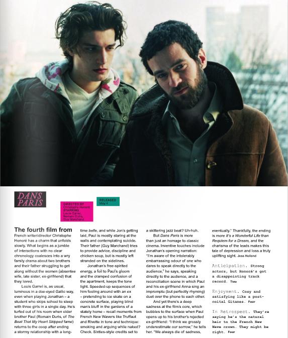
• The review- I think that overall the review works really well. After studying the magazine LittleWhiteLies of which our review would theoretically appear in we had to come to terms with the language used and how to phrase our own work. Having looked at other previous reviews for the magazine such as http://www.littlewhitelies.co.uk/theatrical-reviews/kick-ass/ and http://www.littlewhitelies.co.uk/theatrical-reviews/precious/ it became evident that their approach was informal, direct and straight to the point. They gave an honest review, good or bad and rarely used complex film language and so it would be easy to understand having not studied Media or Film. They also used an interesting rating system which is further explained here: http://www.littlewhitelies.co.uk/theatrical-reviews/eviews/. They would rate the film out of one of three categories being, Anticipation, Enjoyment and In Retrospect each one summed up in one short snappy sentence at the end of each review. It became evident that LittleWhiteLies was a very art based magazine and relied heavily on the layout so we also wanted to make ours as visually stimulating as they did in the actual magazine. Here are a few examples of their layouts:
We also noted that the magazine would dedicate a whole issue to one film and so in addition to our review seen here: http://advancedportfoliolloyd.blogspot.com/2010/04/final-review-alex-lloyd-abi-black.html Jack Storer also created a Credits Page http://advancedportfoliolloyd.blogspot.com/2010/03/credits-little-white-lies-jack-storer.html for the magazine, using alcohol bottles representing our film.

• For our poster we had all initially came up with the same idea of having a sketch like drawing of Milo on the front, mainly just including his face. Having looked at other social realist film posters we knew this was a risk as usually stills from the film are used of iconic images which some the film up captured in a photograph. We also decided having done research on social realism film poster’s that many of them were landscape and so we decided to make ours also landscape. I think that this allowed us to fit a lot more into our poster without it seemed cramped. We chose Jack’s initial poster idea to base it on:


Caroline then went on to further develop this initial idea for the poster by introducing some colour. We also chose to use the most memorable and iconic image in the film, of Milo in the foreground in focus whilst his parents are in the background arguing. I think this picture is very powerful and significant to our film and so helps to set the tone for what’s to come in the film. Here is Caroline’s first development of this.


• Having chosen this one was how we would like our final poster to look we chose to keep the image however move it slightly over to the right and the font for the title and cast names. I think the font connotes a child’s handwriting and also is very bold and clear. Having all agreed on this and helped decide where to place the text and film awards in the final one you can access our final poster: http://4.bp.blogspot.com/_fg4KhnMDHXs/S8t4qN7OVvI/AAAAAAAAATE/-0k8nGFLsM8/s1600/FINAL_POSTER_copy.jpg


• The effect of having Milo in darker colours and all the text co-ordinating with this helps the vivid red on the vodka bottle to stand out, reinforcing our theme of a child coping with alcoholism in his life.
• I think that the combination of the review and the poster help to back up and support our short film, which I found to be one of the most enjoyable tasks we have done.
What have you learnt from your audience feedback?
• We set the target audience for our film to be roughly from the age of 12+ and decided it could be enjoyed by anyone from any social class background.
• We chose to get a range of people to review our film, using Facebook and Youtube. We decided to do this as many people now use social networking sites as a way of communicating and it allowed us to send our work to a whole range of people.
• Here are some examples of audience feedback we received;
“The innocence of the little kids voice really suits the narrative” Charlie Izard, 17
“I liked how the voice continued over the top of everything as it allows you to hear what is going on in this boys head and creates a connection between him and the audience as you feel like he is confiding in you. The monologue was very well written as it sounded like what a child would actually say in that situation, and not too dummed down” Katy Black, 20
“This is so good, I love how the child narrates it” Evie Chandler, 13
• I think all these comments show that we made a good decision to use the monologue over the top of everything. Not only does it help the audience to connect with the protagonist but it also helps to create continuity, keeping the momentum.
• Another scene which we got positive feedback on was the one in where it cuts from an EL establishing shot of the home, to the bottle smashing on the floor. I think this helps the audience to engage with what is happening in this little boy’s life but also creates tension. The tension is then broken as it switches to a contrasting slow motion scene of Milo on the trampoline.
• I think one of the main criticisms we got from our audience feedback which I also think we could have improved on was that the end transition was a bit rushed and we could have taken a bit more time to allow it to happen. However overall the end shot also had positive feedback;
“The way it links back to the first shot as well, with the child eating breakfast and then changes into the older guy is brilliant” Lucy Boakes, 17


• Here is a link to other audience feedback given:
http://advancedportfoliolloyd.blogspot.com/2010/04/further-audience-feedback-caroline.html

How did you use new media technologies in the construction and research, planning and evaluation stages?

• Throughout our production we have all been developing our skills by experimenting using different digital technologies, our first decision being the Sony HD camera. As we had previously decided we wanted our film to have a wide screen format the Sony HD w
as the camera best suited to do so, however at times where this was not available to us we used the MX2 instead.
• One of the main advantages of having the Sony HD was that it allowed us to use manual focus, which proved very effective when we wanted a short depth of field allowing the audience to focus on Milo. Example of this to the right.
• Although Alex did the majority of the filming, we all had a go at using the camera in which I took the panning shots of the fireplace at the beginning of the film.
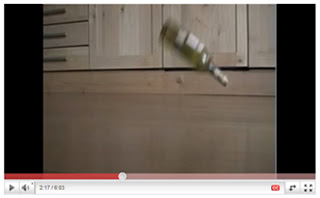
This camera also allowed us to use slow motion, which can be quite difficult to achieve in post production. I think the slow motion scene on the trampoline is one of my favourite scenes as it shows Milo’s attempt to escapism, contrasting with the previous scene of the bottle smashing to the floor. (Slow Motion scene starting at 2:18)

• Not only did we experiment with using a new camera this year but we also used a new editing program which I hadn’t used before, Final Cut Pro. This compared to iMovie last year was a lot more complicated to use however I feel that it has given our film a much more professional feel from last year. Although I did not directly use the program, I gained the knowledge of how to use it at a basic standard and was present at all times during the editing, where a lot of decisions were made.
• Using Final Cut Pro gave us the advantage of changing the saturation of our film, to match the desaturated tones we had seen displayed in other social realist films. It also allowed us to easily add in our soundtrack made by Caroline using Garageband, which I think combined with other follies helped to really polish our film off.

• Having used Blogger.com before from the previous project I had a basic understanding of how to use it. However this year we have all used the blog much more, as a way of communicating ideas, showing evidence of research and planning.

• Using blogger allowed us all to see where each other was at in terms of progress throughout the project, but also gain inspiration and knowledge from what the other person had wrote.
• Last year we mainly used the blog just to write on but this year we have used it much more to import images, use htmls and video links. Example of using a video link:
• Finally one of the last forms of technology we used was Photoshop and InDesign. Adobe Photoshop was extremely useful throughout creating the poster and editing the review. With a vast range of tools it allowed us to manipulate our image, change the saturation and contrasts and so was an obvious choice when it came to creating our final review and poster.

Overall I found the genre of social realism a very enjoyable one to re create and I found that our group worked well as a team. If we were to do this again I would perhaps organise our time better as it was hard to all meet up to film due to prior engagements but also to get our lead actor, Junior Price, free at the same time as well.

Wednesday 28 April 2010

Jack Storer - Evaluation


We have now completed all 3 of our products,
these include.
• A Short Social Realist Film lasting 6 minutes titled 'MILO'


• A Film Poster Advertising 'Milo'


• A Review in the house style of Little White Lies


I am really pleased with all 3 of the pieces and believe the fact we worked so well as a group is what resulted in this.


In What Way Does Your Media Products Use, Develop or Challenge forms of real media conventions?

Firstly the film. we chose to create a social realism film, out of the choices Social realism, Thriller or Horror.

why? simply because we as a group agreed we have a better technical understanding of British social realism and the fact that social realism usually has a low budget and is usually British.

it also has this effect on people


*EMBEDDING OF THIS VIDEO HAS BEEN DISABLED BY THE BBC. TO VIEW PLEASE VISIT http://www.youtube.com/watch?v=Wj9yvVDwhX0*


which is at huge credit to the directors as it shows it doesn't take huge stars, mind blowing CGI effects and a Hollywood size promotions budget to make a film visually stunning and entertaining.

Our film is a short 6minute social realism piece. (film can be viewed at the top of this post)

we studied many British social realist films in lesson and many short social realist films in our own time to then select the conventions we wanted to carry into our own work. we studied films such as Wasp by Andrea Arnold. here is my review.


SOCIAL REALISM - the gritty reality of the working class is really strong in this piece, the dirty sequence of the poor children taking the spare ribs off the car park floor is really moving.

this entire film is so unique she really pushes this gritty british drama to the next stage with the extremity of all shots. i think aswell as being visually and textually powerful it has a simple and effective storyline.
This simple storline fits the short film format amazingly it allows Andrea Arnold to really experiment with shots and what we see. the storyline doesn't need the kids to swear but when they do it just brings the extreme reality to the audience.
the soundtrack was really effective and used almost completly diegetic sound also having the children sing along to the background music at the bar is a really powerful scene it really pushes the fact that they are just children, and they want to just relax and have fun its not their fault they where born into poverty and they don't get to choose their mother.
the themes and issues of this are really clear its the presure thats put on single young mothers in poor conditions and the choices they have to make to protect their kids but how they still try to juggle a social life. as an audience i think we are really put on the side of the kids as we see the shots from outside the car almost a POV of the children.

Director: Andrea Arnold
Writer: Andrea Arnold

won : oscar - best short film - live action

• Themes and issues

we decided right at the beginning of the project we wanted our protagonist to be a young boy. mainly to create a slightly more unique point of view as well as to avoid the A Level faux par of just getting a friend to act for you. also we had watched a lot of shorts by this point and had all agreed a couple of the more powerful films where 'Eight' Directed by Stephen Daldry. (which was really moving and had some great long takes of the boy watching football with a friend) and 'Mixtape' by Luke Snellin this was a really good fun film and was also from the point of view of a young boy played by Son of Randbow star Bill Milner. after writing a review of this film for my research and planning I was lucky enough to get a mention on Luke Snellin's personal blog.
you can see the post here. This was an great surprise to me, and really helped give my enthusiasm for this piece an extra boost.

we then moved on to discuss domestic violence which is common in social realist films and clearly a main point in the film Slap by Uriel Emil Pollack.


"a moving social realist piece which focuses on the real life issue of an abused wife. this story is clearly social realist it plays on emotions of realistic stories and the effect it has on characters.
the one thing about this that stands out as unique is the main characters does the opposite of what we as an audience want her to do. we see her imagine how easy it would be to leave her abusing husband as he 's choking on his dinner. this dream sequence is really effective and we feel asi its happening and then suddenly she chooses not to it snaps back into the room and she goes over and helps her choking husband.
the short film format of this is really effective as it lasts the length of her husband choking but we see flash backs of her lying beaten on her bed and the dream sequence of her leaving. these jumps on time and location are edited well. and would be somthing i would like to attempt in my film but is also very risky i think the whole story would fall apart if they where not edited in so effectively.
the soundtrack is effective as it plays a background role throughout. but i think the visual side of this is what makes it.
the themes and issues are so drastic that we really feel for the lead character."


• Camera work and angles

Lots of hand held! this is something we noticed in many social realist pieces and i think this really puts you there and makes it seem real and is something we tried to use as much as possible, I really like it in this shot...


I think the cramped framing really puts us next to Milo and gives us a feel of being there with him as well as contrasting with this shot that comes next,


which works well to show us even though we relate to him he is so isolated in the situation he is in.

I think the most effective shot of our entire film was the tracking shot lasting 24 seconds. i think this works really well, during discussions for this shot 24 seconds seemed far too long for a single shot of Milo running, but then we looked up the tracking short from 400blows a French new wave film from the legendary François Truffaut as seen here....


this lasts a massive 1 minute 20 yet still holds such power. after we saw this as a group the tracking shot of Milo was a must. although 400 blows was not a British social realist film it was still relevant as French new wave strived for authenticity, similar to the British social realism which strives to create an accurate representation of Britain.

here are stills from both Milo and 4oo Blows
, I love the similarity between them, almost a homage to Truffaut's work.


also a vital point of the camera work was the short depth of field we managed to create using such a high definition camera.


as you can see this really helps separate the parents from Milo and the short depth of field was somthing we had noticed in many social realist films we have looked at. such as this shot from Luke Snellin's Mixtape


• Colour & Lighting

we used desaturated colour which is a common feature of British social realist films usually a result of the directors using natural lighting causing the film to over/under expose slightly. we used a digital film with the white balance set so we recreated this effect in final cut pro. you can see the use of desaturated colour in films such as Fish Tank by Andrea Arnold


we also used as much natural lighting (which is an important convention of social realism) as possible which I think worked well on shots such as this....


I also think this shot works really well as it highlights just how small Milo is. which makes the whole scenareo that little bit more powerful.
here is also a still from This is England demonstrating the use of natural lighting


this is the only sequence in which we used artificial lighting, we used it to back up and emphasise the light from Milo's hand held torch. i think the use of a reflector helped disguise this well.


• Props
we used very few props in our film, and tried to create iconography from the props we did use. for example the alcohol bottles.


we also used the actors own clothes, own bedroom and in the scene where he is hiding under covers we got him to build the 'den' himself. all this contributed to the authenticity of the piece.


• Structure
we spent a large portion of the research time looking at the structure of short films. and found that the majority of short films spend very little time on the equilibrium at the start of the linear structure and we are thrown straight into the story for example
Joyride,

"
the short film format was used really effectively as the loose ends of the story where not tied up. this saved a lot of time for the main event. yet it still had a start middle and end. Just spent very little time on the opening. I really like this idea and think we will definitely take this and try and use this in our piece. a full length film is criticised for having too many unclosed storylines but I believe with short films this makes them more interesting. 'Enigma' "

this is a quote from my original study of Joyride back in January of this year.


this means we avoid getting to know the characters before the 'event' of the film takes place which meant we had to let the audience get to know Milo throughout so as the closure of the film comes we are familiar and have made all the nessecary connections with him as a character. i think this has worked well i also think disguising the parents faces means the audience is completely focused on Milo rather than the arguments his parents have. also this was to show the distance there is between the father and Milo .


• Editing/straight cuts

We are not following the conventions of social realism trying to disguise the edits to make the video flow as much as possible, this continuity editing is a convention of social realism. the aim of continuity is to make the cuts as seemless as possible this was best explained to me when we saw this video in class


The only part of our project in which i believe we wear challenging the conventions of social realism was the location. most social realism films are set in the city and usually up north.


but as a group we really wanted to make alot of the countryside that surrounded this nice detached house. I think this idea really gives a new angle on the genre, we summed this up as a group as the idea that

"broken homes don't only exist in broken cities"

which was one of the suggestions for a tag line.

as you can see we have taken a great deal of inspiration from many directors but one in particular i think really deserves a mention is Ken Loach who is a true master of Social Realism who's latest film 'Looking for Eric' which is such a powerful piece was nominated for the golden palm award at the Cannes Film Festival.

In conclusion to the question I believe our media product uses the standard conventions of Social Realist Genre to its own strength following as closely as possible yet i believe with the use of the rural location we have challenged the standard conventions enough to give our film a unique edge.


How effective is the combination of your main product with your 2 ancillary tasks?

The Review.

Firstly we wrote this review as if it was to be printed to the magazine little white lies. http://www.littlewhitelies.co.uk/ so before we even started to think about making the review we did some research into the house style of the magazine. And found

• Each issue has a ‘Feature Film’ a film that is a reoccurring theme throughout that issue. Here are some covers of a few as examples.


• Key pages are reflected in every issue that relate too this ‘Feature Film’ such as these.


The double page spread, usually on the first 2 pages of the magazine it is a wallposter effect, sporting a quote from the film.


Also the credits at the end take a piece of the ‘feature film’ and relate it to themselves. This is just abit of fun at the end of each issue

So to really get to know the magazine Alex and I decided to create these pages as if ‘Milo’ our short film was the feature film of an issue. So I used photoshop to mock up a couple of quick images paying a lot of attention to the small details of little white lies.


I really think the time Alex and I spent studying these little details is what really gave us a feel for the magazine. So when it came to the layout of the review we were confident.


Then we got too writing the review.

Here is an example of little white lies review

And here is ours


As you can see we have manage to match the layout all the way down to the ‘key film’ page numbers.

As for the text.

here is some quotes so you can see the language used in these reviews.. One of theirs


"
A striking work of shattering simplicity that details a grieving society slowly coming to terms with its past"

and a quote from ours

"
short social realism piece drenched with the stark realities of everyday life. "


we tried to give an accurate intellectual look on our piece without using too much film terminology.


In conclusion of the review I believe we have managed to create a really effective review that would work well if Little White Lies were to create a ‘Milo’ issue.

this is our poster design.


• the first thing I noticed when we started to look at British film posters was that alot more of them are Landscape than Hollywood films which all seem to be portrait as demonstrated below


so this was the first decision made.

• next was the image style originally i Sketched this up using Photoshop I really like the artistic style this gave off which would hopefully reflect the artistic side of our film


then Caroline advanced this to...


then as a group we decided we would create a single line sketch made uip of our monologue, here is a rough mock up of that idea


but before I completely finished this idea I really wasn't happy with it, it didn't hold enough depth to represent our film and I believed it wouldn't have done our film justice, so we gathered the group up and I explained the problem. luckily we chatted about it and all agreed that it would be a waste of time completing that if I didn't think it would look as effective as we had first planned so we agreed on Caroline's image which I then further edited it until we found a final composition and framing which we all liked.


• then we added the Cannes film festival logo, this really helps bring in the audience, people will recognise this and will then know the standard of the piece.

we also selected the quote

"Creative, Captivating and Compelling"


I think this alliteration really pushes the idea of the piece being deep and moving.

also we decided that we should hide the location, we didn't want to put off the city audience who like social realism because it is so urban, so we created the poster in such a way that it is location-less, this could quite easily be a boy in the middle of Manchester.


I think as a social realist piece this works well, the directors box, quote and awards help bring the piece to life.

As a combination, a film poster and a review help summarise the campaign that would run along side 'Milo' if it was too be released through distribution. also the choice of Little White Lies was made as it is the most likely magazine to promote a low budget British short film. there would be no point creating a review in the style of Total Film as they promote high concept Hollywood movies. it would be unrealistic for on one page to have Gerard butler blowing up buildings and on the next a small boy having problems at his countryside house in a village called Turners Hill in Sussex.

What Have You Learnt Through Audience Feedback?

We used the internet for our feedback to allow us to reach as many people in our target audience as possible. Our main point of contact was this FACEBOOK PAGE

• we decided to chose facebook because in today's increasing social networking society facebook is arguably the most popular. with....


* More than 400 million active users
* 50% of our active users log on to Facebook in any given day
* Average user has 130 friends
* People spend over 500 billion minutes per month on Facebook


those statistics are taken from the Facebook Press Pack, 2010

here is a screen print of our Facebook page.


we also sent emails out asking for feedback as well as using twitter and comments on youtube

• Overall the feedback was very possitive! if you look on our facebook page by clicking here you will see this.

• one lady replied early on with "Well done! Really liked it..especially the bit with the boy running down the road. Got the sense of his loneliness and separation from his dad and the vulnerability of his mum."

I think it was this comment that for me personally made me realise that sticking up for the long tracking shot paid off.

• Also we where told the other day that one girl aged 18 watched it with her friend age 17 and her friend had a tear in her eye by the end of it. I think this shows that the effort Abigail and Caroline put into the monologue was really worth it.


From this feedback we have learnt a lot, including many things we would change if we where to re-shoot this piece. we have been told the monologue seems to loose power as the story progresses as well as there not being enough footage of Milo once he had grown up. I couldn't agree more with this last comment as I don't think the equilibrium at the end of the film lasted long enough, we could have possibly included a shot of the older Milo playing with friends/eating McDonald's.


How Did You Use New Media Technologies In The Construction, research & Planning and Evaluation Stages?

• Firstly the use of the blog was vital. it allowed us to all work on seperate elements of research at home yet display the work together, also the navigation bar (shown below)


allowed us to easily flick back to previous pieces when discussing new ideas. the blog was a great idea, and I think really helped us work as a team and bounce ideas back and fourth between ourselves.

• when researching and planning our films there was one site in particular that really helped me personally

BBC SHORTS

this is a great selection of short films and was the source for a lot of my initial research films such as

Cubs


and here is my review of the film


• Digital stills were also really useful for initial research on location.


• Google maps also helped us when planning where we wanted to film, and when filling in this location survey


during the actual production we used...

• Sony HDV camera
this camera was high enough quality to create the short depth of field. which is what made the camera choice easy.

• Dictaphone - the use of sound recording was vital to help give a clean sound to monologue that ran throughout the film.


we then moved onto post production using,


• Final Cut Pro was a must when it came to editing, although our editing was simple using this professional standard editing software just gave us that extra edge that would have been harder to create in 'iMovie'.

• Garage band was used to create our soundtrack, this was used at both start and finish of our film. but we did try to use this as little as possible.

• I edited the poster in Photoshop CS4 which allowed us to simply create different styling, colour and composition

we used similar techniques to those displayed in this video.


• InDesign was the program of choice for the review which I strongly dislike. I really can't get used to the short cut's as all my previous practise has been on Photoshop so force of habit sometimes lead to me making massive mistakes.

and exhibiting the final products

• Facebook was the key source for audience feedback with an embedded video from Youtube and all our friends/contacts were invited to this group.

• YouTube was used to give us a platform for the video to be uploaded to. really useful as it was easy to embed this into other sites and also allowed us to get feedback on the comments section.

Finally.

I am really pleased with the outcome of this entire project. i think the success is a good reflection of the time we spent on this as a group and the effort we put into the work. i think the enthusiasm of the group is shown in our blog with small things such as the mention of my name thanking me for the review of mixtape by Luke Snellin, and the extra little pieces we designed in relation to Little White Lies helped keep this project alive from start to finish. i believe this is what has taken our project that little further from my AS project. which in all honesty by the end of the project i was a little tired of. i think this passion for the piece from the whole group combined with our learnt skills and knowledge is what made this project work.