We have now completed all 3 of our products, these include.
• A Short Social Realist Film lasting 6 minutes titled 'MILO'
• A Film Poster Advertising 'Milo'
• A Review in the house style of Little White Lies
I am really pleased with all 3 of the pieces and believe the fact we worked so well as a group is what resulted in this.
In What Way Does Your Media Products Use, Develop or Challenge forms of real media conventions?
Firstly the film. we chose to create a social realism film, out of the choices Social realism, Thriller or Horror.
why? simply because we as a group agreed we have a better technical understanding of British social realism and the fact that social realism usually has a low budget and is usually British.
it also has this effect on people
*EMBEDDING OF THIS VIDEO HAS BEEN DISABLED BY THE BBC. TO VIEW PLEASE VISIT http://www.youtube.com/watch?v=Wj9yvVDwhX0*
which is at huge credit to the directors as it shows it doesn't take huge stars, mind blowing CGI effects and a Hollywood size promotions budget to make a film visually stunning and entertaining.
Our film is a short 6minute social realism piece. (film can be viewed at the top of this post)
we studied many British social realist films in lesson and many short social realist films in our own time to then select the conventions we wanted to carry into our own work. we studied films such as Wasp by Andrea Arnold. here is my review.
SOCIAL REALISM - the gritty reality of the working class is really strong in this piece, the dirty sequence of the poor children taking the spare ribs off the car park floor is really moving.
this entire film is so unique she really pushes this gritty british drama to the next stage with the extremity of all shots. i think aswell as being visually and textually powerful it has a simple and effective storyline.
This simple storline fits the short film format amazingly it allows Andrea Arnold to really experiment with shots and what we see. the storyline doesn't need the kids to swear but when they do it just brings the extreme reality to the audience.
the soundtrack was really effective and used almost completly diegetic sound also having the children sing along to the background music at the bar is a really powerful scene it really pushes the fact that they are just children, and they want to just relax and have fun its not their fault they where born into poverty and they don't get to choose their mother.
the themes and issues of this are really clear its the presure thats put on single young mothers in poor conditions and the choices they have to make to protect their kids but how they still try to juggle a social life. as an audience i think we are really put on the side of the kids as we see the shots from outside the car almost a POV of the children.
Director: Andrea Arnold
Writer: Andrea Arnold
won : oscar - best short film - live action
• Themes and issues
we decided right at the beginning of the project we wanted our protagonist to be a young boy. mainly to create a slightly more unique point of view as well as to avoid the A Level faux par of just getting a friend to act for you. also we had watched a lot of shorts by this point and had all agreed a couple of the more powerful films where 'Eight' Directed by Stephen Daldry. (which was really moving and had some great long takes of the boy watching football with a friend) and 'Mixtape' by Luke Snellin this was a really good fun film and was also from the point of view of a young boy played by Son of Randbow star Bill Milner. after writing a review of this film for my research and planning I was lucky enough to get a mention on Luke Snellin's personal blog.
you can see the post here. This was an great surprise to me, and really helped give my enthusiasm for this piece an extra boost.
we then moved on to discuss domestic violence which is common in social realist films and clearly a main point in the film Slap by Uriel Emil Pollack.
"a moving social realist piece which focuses on the real life issue of an abused wife. this story is clearly social realist it plays on emotions of realistic stories and the effect it has on characters.
the one thing about this that stands out as unique is the main characters does the opposite of what we as an audience want her to do. we see her imagine how easy it would be to leave her abusing husband as he 's choking on his dinner. this dream sequence is really effective and we feel asi its happening and then suddenly she chooses not to it snaps back into the room and she goes over and helps her choking husband.
the short film format of this is really effective as it lasts the length of her husband choking but we see flash backs of her lying beaten on her bed and the dream sequence of her leaving. these jumps on time and location are edited well. and would be somthing i would like to attempt in my film but is also very risky i think the whole story would fall apart if they where not edited in so effectively.
the soundtrack is effective as it plays a background role throughout. but i think the visual side of this is what makes it.
the themes and issues are so drastic that we really feel for the lead character."
• Camera work and angles
Lots of hand held! this is something we noticed in many social realist pieces and i think this really puts you there and makes it seem real and is something we tried to use as much as possible, I really like it in this shot...

I think the cramped framing really puts us next to Milo and gives us a feel of being there with him as well as contrasting with this shot that comes next,

which works well to show us even though we relate to him he is so isolated in the situation he is in.
I think the most effective shot of our entire film was the tracking shot lasting 24 seconds. i think this works really well, during discussions for this shot 24 seconds seemed far too long for a single shot of Milo running, but then we looked up the tracking short from 400blows a French new wave film from the legendary François Truffaut as seen here....
this lasts a massive 1 minute 20 yet still holds such power. after we saw this as a group the tracking shot of Milo was a must. although 400 blows was not a British social realist film it was still relevant as French new wave strived for authenticity, similar to the British social realism which strives to create an accurate representation of Britain.
here are stills from both Milo and 4oo Blows, I love the similarity between them, almost a homage to Truffaut's work.
also a vital point of the camera work was the short depth of field we managed to create using such a high definition camera.

as you can see this really helps separate the parents from Milo and the short depth of field was somthing we had noticed in many social realist films we have looked at. such as this shot from Luke Snellin's Mixtape

• Colour & Lighting
we used desaturated colour which is a common feature of British social realist films usually a result of the directors using natural lighting causing the film to over/under expose slightly. we used a digital film with the white balance set so we recreated this effect in final cut pro. you can see the use of desaturated colour in films such as Fish Tank by Andrea Arnold

we also used as much natural lighting (which is an important convention of social realism) as possible which I think worked well on shots such as this....

I also think this shot works really well as it highlights just how small Milo is. which makes the whole scenareo that little bit more powerful.
here is also a still from This is England demonstrating the use of natural lighting


this is the only sequence in which we used artificial lighting, we used it to back up and emphasise the light from Milo's hand held torch. i think the use of a reflector helped disguise this well.
• Props
we used very few props in our film, and tried to create iconography from the props we did use. for example the alcohol bottles.

we also used the actors own clothes, own bedroom and in the scene where he is hiding under covers we got him to build the 'den' himself. all this contributed to the authenticity of the piece.
• Structure
we spent a large portion of the research time looking at the structure of short films. and found that the majority of short films spend very little time on the equilibrium at the start of the linear structure and we are thrown straight into the story for example
Joyride,
"the short film format was used really effectively as the loose ends of the story where not tied up. this saved a lot of time for the main event. yet it still had a start middle and end. Just spent very little time on the opening. I really like this idea and think we will definitely take this and try and use this in our piece. a full length film is criticised for having too many unclosed storylines but I believe with short films this makes them more interesting. 'Enigma' "
this is a quote from my original study of Joyride back in January of this year.
this means we avoid getting to know the characters before the 'event' of the film takes place which meant we had to let the audience get to know Milo throughout so as the closure of the film comes we are familiar and have made all the nessecary connections with him as a character. i think this has worked well i also think disguising the parents faces means the audience is completely focused on Milo rather than the arguments his parents have. also this was to show the distance there is between the father and Milo .
• Editing/straight cuts
We are not following the conventions of social realism trying to disguise the edits to make the video flow as much as possible, this continuity editing is a convention of social realism. the aim of continuity is to make the cuts as seemless as possible this was best explained to me when we saw this video in class
The only part of our project in which i believe we wear challenging the conventions of social realism was the location. most social realism films are set in the city and usually up north.

but as a group we really wanted to make alot of the countryside that surrounded this nice detached house. I think this idea really gives a new angle on the genre, we summed this up as a group as the idea that
"broken homes don't only exist in broken cities"
which was one of the suggestions for a tag line.
as you can see we have taken a great deal of inspiration from many directors but one in particular i think really deserves a mention is Ken Loach who is a true master of Social Realism who's latest film 'Looking for Eric' which is such a powerful piece was nominated for the golden palm award at the Cannes Film Festival.
In conclusion to the question I believe our media product uses the standard conventions of Social Realist Genre to its own strength following as closely as possible yet i believe with the use of the rural location we have challenged the standard conventions enough to give our film a unique edge.
How effective is the combination of your main product with your 2 ancillary tasks?
The Review.
Firstly we wrote this review as if it was to be printed to the magazine little white lies. http://www.littlewhitelies.co.uk/ so before we even started to think about making the review we did some research into the house style of the magazine. And found
• Each issue has a ‘Feature Film’ a film that is a reoccurring theme throughout that issue. Here are some covers of a few as examples.


• Key pages are reflected in every issue that relate too this ‘Feature Film’ such as these.


The double page spread, usually on the first 2 pages of the magazine it is a wallposter effect, sporting a quote from the film.


Also the credits at the end take a piece of the ‘feature film’ and relate it to themselves. This is just abit of fun at the end of each issue
So to really get to know the magazine Alex and I decided to create these pages as if ‘Milo’ our short film was the feature film of an issue. So I used photoshop to mock up a couple of quick images paying a lot of attention to the small details of little white lies.


I really think the time Alex and I spent studying these little details is what really gave us a feel for the magazine. So when it came to the layout of the review we were confident.
Then we got too writing the review.
Here is an example of little white lies review
And here is ours

As you can see we have manage to match the layout all the way down to the ‘key film’ page numbers.
As for the text.
here is some quotes so you can see the language used in these reviews.. One of theirs
"A striking work of shattering simplicity that details a grieving society slowly coming to terms with its past"
and a quote from ours
"short social realism piece drenched with the stark realities of everyday life. "
we tried to give an accurate intellectual look on our piece without using too much film terminology.
In conclusion of the review I believe we have managed to create a really effective review that would work well if Little White Lies were to create a ‘Milo’ issue.
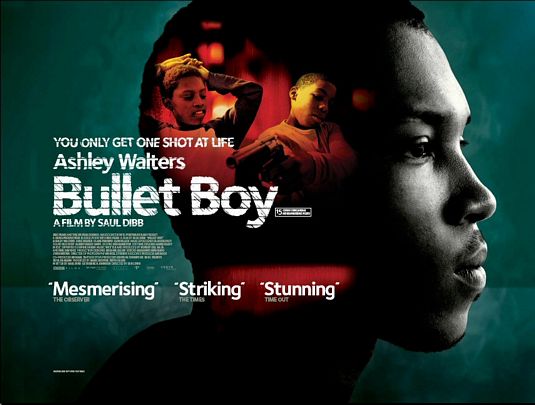
this is our poster design.
• the first thing I noticed when we started to look at British film posters was that alot more of them are Landscape than Hollywood films which all seem to be portrait as demonstrated below

so this was the first decision made.
• next was the image style originally i Sketched this up using Photoshop I really like the artistic style this gave off which would hopefully reflect the artistic side of our film

then Caroline advanced this to...

then as a group we decided we would create a single line sketch made uip of our monologue, here is a rough mock up of that idea

but before I completely finished this idea I really wasn't happy with it, it didn't hold enough depth to represent our film and I believed it wouldn't have done our film justice, so we gathered the group up and I explained the problem. luckily we chatted about it and all agreed that it would be a waste of time completing that if I didn't think it would look as effective as we had first planned so we agreed on Caroline's image which I then further edited it until we found a final composition and framing which we all liked.
• then we added the Cannes film festival logo, this really helps bring in the audience, people will recognise this and will then know the standard of the piece.
we also selected the quote
"Creative, Captivating and Compelling"

I think this alliteration really pushes the idea of the piece being deep and moving.
also we decided that we should hide the location, we didn't want to put off the city audience who like social realism because it is so urban, so we created the poster in such a way that it is location-less, this could quite easily be a boy in the middle of Manchester.

I think as a social realist piece this works well, the directors box, quote and awards help bring the piece to life.
As a combination, a film poster and a review help summarise the campaign that would run along side 'Milo' if it was too be released through distribution. also the choice of Little White Lies was made as it is the most likely magazine to promote a low budget British short film. there would be no point creating a review in the style of Total Film as they promote high concept Hollywood movies. it would be unrealistic for on one page to have Gerard butler blowing up buildings and on the next a small boy having problems at his countryside house in a village called Turners Hill in Sussex.
What Have You Learnt Through Audience Feedback?
We used the internet for our feedback to allow us to reach as many people in our target audience as possible. Our main point of contact was this FACEBOOK PAGE
• we decided to chose facebook because in today's increasing social networking society facebook is arguably the most popular. with....
* More than 400 million active users
* 50% of our active users log on to Facebook in any given day
* Average user has 130 friends
* People spend over 500 billion minutes per month on Facebook
those statistics are taken from the Facebook Press Pack, 2010
here is a screen print of our Facebook page.

we also sent emails out asking for feedback as well as using twitter and comments on youtube
• Overall the feedback was very possitive! if you look on our facebook page by clicking here you will see this.
• one lady replied early on with "Well done! Really liked it..especially the bit with the boy running down the road. Got the sense of his loneliness and separation from his dad and the vulnerability of his mum."
I think it was this comment that for me personally made me realise that sticking up for the long tracking shot paid off.
• Also we where told the other day that one girl aged 18 watched it with her friend age 17 and her friend had a tear in her eye by the end of it. I think this shows that the effort Abigail and Caroline put into the monologue was really worth it.
From this feedback we have learnt a lot, including many things we would change if we where to re-shoot this piece. we have been told the monologue seems to loose power as the story progresses as well as there not being enough footage of Milo once he had grown up. I couldn't agree more with this last comment as I don't think the equilibrium at the end of the film lasted long enough, we could have possibly included a shot of the older Milo playing with friends/eating McDonald's.
How Did You Use New Media Technologies In The Construction, research & Planning and Evaluation Stages?
• Firstly the use of the blog was vital. it allowed us to all work on seperate elements of research at home yet display the work together, also the navigation bar (shown below)

allowed us to easily flick back to previous pieces when discussing new ideas. the blog was a great idea, and I think really helped us work as a team and bounce ideas back and fourth between ourselves.
• when researching and planning our films there was one site in particular that really helped me personally
BBC SHORTS
this is a great selection of short films and was the source for a lot of my initial research films such as
Cubs
and here is my review of the film
• Digital stills were also really useful for initial research on location.


• Google maps also helped us when planning where we wanted to film, and when filling in this location survey
during the actual production we used...
• Sony HDV camera
 this camera was high enough quality to create the short depth of field. which is what made the camera choice easy.
 • Dictaphone - the use of sound recording was vital to help give a clean sound to monologue that ran throughout the film.
we then moved onto post production using,
• Final Cut Pro was a must when it came to editing, although our editing was simple using this professional standard editing software just gave us that extra edge that would have been harder to create in 'iMovie'.
• Garage band was used to create our soundtrack, this was used at both start and finish of our film. but we did try to use this as little as possible.
• I edited the poster in Photoshop CS4 which allowed us to simply create different styling, colour and composition
we used similar techniques to those displayed in this video.
• InDesign was the program of choice for the review which I strongly dislike. I really can't get used to the short cut's as all my previous practise has been on Photoshop so force of habit sometimes lead to me making massive mistakes.
and exhibiting the final products
• Facebook was the key source for audience feedback with an embedded video from Youtube and all our friends/contacts were invited to this group.
• YouTube was used to give us a platform for the video to be uploaded to. really useful as it was easy to embed this into other sites and also allowed us to get feedback on the comments section.
Finally.
I am really pleased with the outcome of this entire project. i think the success is a good reflection of the time we spent on this as a group and the effort we put into the work. i think the enthusiasm of the group is shown in our blog with small things such as the mention of my name thanking me for the review of mixtape by Luke Snellin, and the extra little pieces we designed in relation to Little White Lies helped keep this project alive from start to finish. i believe this is what has taken our project that little further from my AS project. which in all honesty by the end of the project i was a little tired of. i think this passion for the piece from the whole group combined with our learnt skills and knowledge is what made this project work.