What We Did
For our A2 media coursework, we had a few tasks to complete:
· A short film lasting approximately 5 minutes
· A film poster for our short film
· A film review written in the house style of a chosen review magazine 
Our final short was a 6 minute social realism film about a young boy who finds himself neglected from both his parents in life. With his Mum suffering from domestic abuse and his Dad being an alcoholic we see what he gets up to.
1/ In what ways does your media product use, develop or challenge forms and conventions of real media products?
During the planning and research stages we had to look at conventions in:
· Narrative
· Themes and Issues
· Camerawork
· Camera Movement
· Mise En Scene
· Editing
· Sound
· Character Types
· Representation
· Audience Targeting
We were able to establish how these conventions were used by watching many British social realism films, most of which would have a similar narrative and story to ours. Films we paid close attention to were:
· Eight
· Wasp
· Cubs
· Billy Elliot
· The 400 Blows
· This Is England
· Red Road
We learnt that Social Realism aims to represent the lives of ordinary people in ways that appear very ‘true to life’. They tend to include:
Narrative
· Tends to follow Todorov’s narrative theory being the Three-Act Structure, this includes a Set-Up, Disruption and Resolution. One difference that is typically seen in social realism films is that in the set-up where we first meet the characters, already their lives are not happy.
· Both restricted and unrestricted narration can be created, restricted narration may be caused from the characters keeping something hidden from us or not telling us something important (e.g. In ‘Eight’ we never know how his father died). Unrestricted narration is kept through its camerawork and can be used with help from a voice over.
· The story tends to include day to day problems experienced by the protagonist.
· Not always does the film have to be depressing throughout (see ‘Happy Go Lucky’) but there are always problems the character must resolve.
· Thanks to the relaxation of censorship in the early years of social realism films, characters had sex lives, money worries and social problems. British ‘auteurs’ like Karel Reisz and Tony Richardson dealt with prostitution, abortion, homosexuality, alienation and relationship problems. This is when social realism grew to be seen as the genre that represents life realistically and not such a ‘happily ever after’ story Hollywood films would offer.
Themes and Issues
· Focuses on working class and class issues
· Based on real life issues in time (this may be with class, ethnicity, government etc)
Camerawork
· A lot o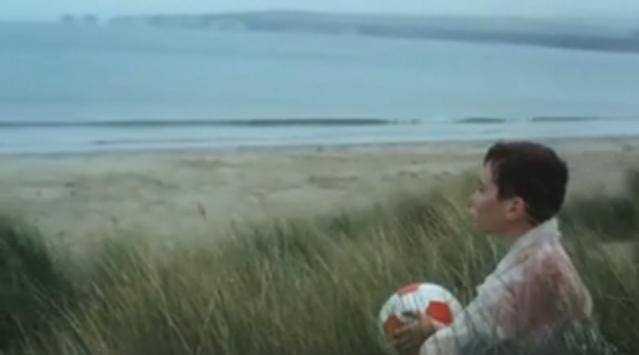 f subjective camerawork around the main character, this tends to build empathy from the spectator.
· Extreme Long shots are used to show the mise en scene clearly with a lot of establishing shots becoming very effective.
· Long shots in duration, these can enhance the importance of what’s either being seen or heard on screen.
· Manual Focus includes the background being blurred out with the subject in the foreground in focus.
Camera Movement
· Movement can be used to express the feeling and emotions the character may be experiencing. In ‘Wasp’ the camera is hand held and can be quite wobbly, this creates a rushed feeling becoming quite tense in places. The long tracking shot in ‘The 400 Blows’ became very significant to our group, it showed the young boys loneliness.
Mise En Scene
· Gritty, urban settings and decor known for its time
· Natural lighting tends to be used to create realism
· Any props used will be recognisable icons of the time in which the film was set in
· Costume and Hair will be recognised for its time and will connote the status and class of the characters
Editing 
· Desaturated colour to enhance the gritty, dirty backgrounds and a depressed, upsetting mood.
· Match on Actions will be used to keep continuity
· Shot/Reverse Shot between characters in conversation
· 180 degree rule will always be kept in order to prevent confusing the audience
· No special effects as these take away the realism
Sound
· Sound is always parallel to what’s on screen, narration is a typical convention being heard through a voice over. This can create empathy and allows the audience to really understand the characters.
· Both diegetic and non diegetic sounds used
· Barely any SFX, Foleys may be used
· Any music used will be well known for the time in which the film was set in
· Sound bridges used in order to keep continuity
Character Types + Representation
· Characters tend to be from unwealthy, working class backgrounds. 
· Audience empathise for characters, even through the times where what they may be doing is wrong. In ‘This Is England’ we witness our main character insult a man racially but throughout we still see him as our protagonist.
· The main character tends to be quite inferior and powerless, they may seek help from someone. In all of the films we watched that included a story similar to ours included either a young child or a woman as the main character.
Audience Targeting
· The films we have seen have targeted from 18 to 40 approximately.
· Film literates are always targeted for social realism films.
· A younger audience may be attracted to films such as ‘Cubs’ and ‘Eight’ for example due to the characters and themes whereas ‘Wasp’, ‘This Is England’ and ‘Red Road’ for example would target an older audience who appreciate social realism films.
· Many of the films will have made a poster that may target an urban audience and one that may target a more local audience. One that may target a working class audience and one that may target more of middle class audiences.
Look at a previous post: http://advancedportfoliolloyd.blogspot.com/2010/03/poster-research-alex-lloyd-jack-storer.html - Showing you how Andrea Arnold targeted different types of audiences through her poster.
This style and genre of film was introduced in the early 1900’s with Director David Lean having a huge part. Making films such as: ‘In Which We Serve’, ‘Brief Encounter’ and ‘Oliver Twist’, they reflect the extent and influence of historical and societal changes across his period. He was well known for his focus on the lives of “ordinary people”.
From ‘Brief Encounter’ to ‘Happy Go Lucky’ social realism has brought Britain many classic films and has become Britain’s richest gift to world cinema. Other Directors we were influenced by during the planning and production stages of our short were:
· Ken Loach (‘Kes’, ‘Looking for Eric’, ‘Sweet 16’)
· Mike Leigh (‘Happy Go Lucky’)
· Stephen Daldry (‘Billy Elliot’, ‘Eight’)
· Francois Truffaut (‘The 400 Blows’)
· Luke Snellin (‘Mixtape’, ‘Patrick’)
· Andrea Arnold (‘Wasp’, ‘Red Road’, ‘Fish Tank’)
· Shane Meadows (‘This Is England’)
The aims that these directors have all had throughout their productions are to represent their characters in a way that will attract their target audience and in a way that will build empathy from the spectator.
Andrea Arnold’s aims in Wasp were to:
· Show the main character, Zoe in all her complexity.
· To create empathy for Zoe, as well as the kids even though what Zoe may be doing is verging on abuse.
· Andrea wanted people to understand her behaviour rather than just condemning it showing how a person’s circumstances and environment influences the way they essentially are. This was her main aim in the production of her award winning short film ‘Wasp’.
Stephen Daldry’s aim was to represent this young boy as a naive child who only wants to follow the footsteps of his father, not knowing that how he may have passed away might have had something to do with the dangers of football supporting. The narration from the child causes the spectator to really feel sorry for him, he never explains how his father died but with what is given to us, we can really piece it together throughout the story.
Each of these directors’s have all used common features and conventions of soci al realist films whether their films are shorts or full length feature films. Examples are:
· They focus on the working class basing their films in gritty and usually urban working class areas. (Look at ‘Wasp’ – Andrea Arnold)
· The themes and issues are based on real life past events. (Look at ‘This Is England’ – Shane Meadows and how that the issues in the film are particular of the year 1983 with growing unemployment and a hatred for foreign minorities.)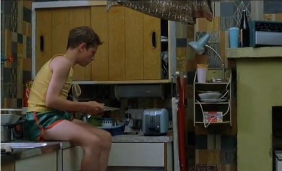
· Lighting is almost always natural with very limited artificial lighting being used. Desaturated colour is edited in to give them a melancholy feel. (Look at ‘Billy Elliot’ – Stephen Daldry)
· They have all used focus to show the characters facial expressions clearly but to also blur out the background making the whole picture seem grittier. (Look at ‘Wasp’ – Andrea Arnold)
· The camera is very rarely still in some films fitting with the mood of the characters, this may be rushed or tense. (Look at ‘Fish Tank’ – Andrea Arnold)
· As mentioned above, the main protagonists of the films tend to be very young, the oldest out of the films I have mentioned is Zoe who would be mid 20’s. Most of the films include a much younger protagonist, this increases empathy to see them in such difficult times at such a young age. It represents how difficult it can be for single, working class parents for example, how difficult it can be to have lost your father at the age of eight for example etc. Many people can relate to these realistic situations and those who can’t are given an insight into how gritty and hard it can be. (The young protaganist from 'Cubs')
Ways In Which We Have Conformed To The Conventions Of Social Realism
Narrative
- It can be difficult to include the three act structure within a short film of rou ghly 5 minutes, in a feature film, the set-up will introduce the characters in their everyday life. A confrontation or disruption will then soon occur disrupting this everyday lifestyle, the character will be put upon a challenge of which must be resolved for him to carry on with his life. In our short, we did what many other short film directors have done such as Stephen Daldry with ‘Eight’, we introduced our character and problem at the same time. The first few shots have no dialogue in but show our character allowing the audience to get an idea that our film is about a young boy. Then when the problem is int
 roduced through the voice over of our child, the audience will understand that it is his father causing all the misery.
- Our story puts our protagonist in a neglected position, the spectator can empathise.
- Unrestricted narration is kept through the voice over of Milo, the spectator is omniscient throughout the film.
- The problem is resolved in the final few shots of the film, “but that’s in the past, it’s just me and mum now” – Milo explains to us that now his Dad has left, his problems are in the past. This gives closure on the situation for the audience finishing off on a high.
Themes and Issues
- Isolation, Neglection, Alcoholism, Domestic Abuse – These are all problems that occur across the country in many young people’s lives. (Look at 'Wasp', 'Fish Tank')
- Evidence of how the audience will understand these are the issues is by the dominant voice over, “I’ve seen him hit her, he hits her nearly every day”. These become quite powerful words being used by a young child.
Camerawork
- Our camerawork has become very successful being both creative and conformist. We have used the typical extreme long shots seen in many social realist films, these establishing shots help show the class of our family through their environment. In our film, the home in whic h Milo lives in also finds itself isolated surrounded by nothing but countryside, this enhances the loneliness of Milo.
- Subjective camerawork is used to keep the empathy towards our young character, this is done through mid shots and close ups where the spectator can analyse his mood through facial expressions.
- We have included many long shots in duration, the shots with the most length are the most important shots due to both what is seen on screen and what is being said on the voice over. One example of this is the shot in which his parents are arguing behind him, in this Milo tells us what is wrong in his life, at the same time we can empathise for him due to his facial expressions.
- As Director, my favourite part of filming was the use of manual focus. This was new to me as I did not use it within my foundation portfolio, for our social realism film I felt it has become very important. It was noticed of being a big convention of British social realism, films such as ‘Wasp’, ‘Fish Tank’, ‘Eight’ and ‘Cubs’ all use it. The subject tends to be in the foreground in focus with the background out of focus, we used this focusing in the shot with Milo’s parents arguing in the background, one reason for this was to conform to the convention but another was to hide their identity. This hidden identity creates a ‘criminal’ effect, it is similar to what is seen on programmes such as ‘crime watch’ where the face of the criminal has been blurred. This loss of identity may creat e tension for the spectator.
- We also used this focus on a shot where the focus is on some leaves in the foreground, it is then noticed that the house is in the background, this enhances the fact that the house is surrounded by forest land but is also quite a creative shot in my opinion and may attract film literates.
- One of our intentions was to keep the camerawork quite simple, there doesn’t tend to be a huge variety of shot sizes and angles used within our short social realism as this may distract the audience from empathising from the character for example, of which is a crucial point to any social realist film. The camerawork was kept simple using mainly eye level angle shots and mid-shots.
Camera Movement
- Camera work was kept plain and simple but camera movement on the other hand had to be more creative, we did use a lot of still shots close up to the character so that his emotions could be recognised. The shots we included with movement in turned out to be our most attractive shots to viewers, the long tracking shot seen 3:43 seconds into the film turned out to be our audience’s favourite shot.
- Other shots would be hand held and may seem quite wobbly, this is something we learnt not to be accidental but purposely used (look at ‘Fish Tank’ – Andrea Arnold). The wobbly effect is barely noticeable and therefore doesn’t take away the audience’s attention, in my opinion it prevents boredom as a film with only still shots would become very boring. It also creates realism and can put the spectator there with the character as if he is moving with Milo.
Mise En Scene
- Detailed Mise En Sce ne for any social realism is crucial but particually in our film as it is challenging conventions by using a middle class family as in Secrets and Lies - Mike Leight, we included lots of bottles and cans to connote alcoholism.
- Props such as photo’s, candles, cereal and toothpaste etc give it that homely atmosphere and creates realism
- The settings show a lot of countryside surrounding the home enhancing Milo’s isolation from any friends.
- Decor is middle class, it is a warm, cosy home that is at war with the mess Milo’s father is causing it to have.
- The costume of Milo sees him as a messy, young boy who doesn’t seem to have been treated with fashionable clothes and an expensive haircut. It fits in with the countryside a nd distance he has away from any town centre.
- The top he goes out in throughout is stripy, this is so in the extreme long shots and shots of him in the tree, he is easily noticeable within the shot.
- Composition of the subject and framing in shot shows him rarely in the centre, this prevents it from looking very basic and amateur like but can also make him look smaller in the picture. Look at ‘Wasp’, Zoe’s face is seen a lot to the side of the frame with the background blurred out.
 Editing
- Desaturated colour has been edited in throughout
- Match on actions used to create continuity – First scene in which Milo walks into kitchen and makes breakfast.
Sound
- Sound is very important for our film, the voice over is the most dominant type of sound used.
- Non-Diegetic sound includes stringed instruments playing in a minor key, this is parallel music creating a sad mood.
- No SF X used
- Only one Foley used (Alarm clock in second shot) – The tracking shot originally had the sound of a car driving in the rushes, we wondered whether to take all the sound off and have Foleys of Milo running and breathing, in the end we chose to take all the sound off and have nothing but the voice over and non diegetic music playing. This works a lot better as I think that if we were to include Foleys as well, there would be too much sound for the spectator to concentrate fully on what Milo is saying.
- Diegetic sound used such as cupboard doors opening and closing, birds singing. This keeps the realism and can put the audience in Milo’s position as if they are there with him.
- The sudden ‘smash’ of the bottle as it hits the floor (shot 16) is diegetic ‘on-screen’ sound. We cut out the non diegetic suddenly along with the bottle ‘smashing’ making it seem to interrupt everything in the film at that point, it connotes how loud and dangerous things can  be around Milo’s home. After the sound everything is silent and Milo’s voice over carries on.
- Sound bridges are used to keep continuity between two shots, we have used a lot of sound bridges and have been able to do it a lot easier due to most of the sound coming from a voice over. A Good example of our sound bridging is where we can begin to hear the parents arguing whilst watching a bird eating, this puts us with the sound of anger whilst looking at a relaxing picture and the clash between the two can be noticed. The fact that they don’t contrast will connote the problem in Milo’s life.
Character Types + Representation
- After our planning and research into other social realist shorts, we always knew that we wanted a young actor to play the lead role, it being quite a typical convention of this genre. To see such young people put in difficult situations can easily be empathised for by any spectator.
- Representation is an important convention of social realism, in order to build empathy for a character he/she must be represented well. Once we found our actor (Milo Price) we saw how easy it was to represent this boy as an isolated, upset little boy who was never content in life not being able to experience loving and caring parents. This was easily represented through good acting and our camerawork could easily show the facial expressions and body language of our protagonist.
- We never fully see the Mum and Dad of Milo, only ever having them blurred out  in shot. Despite this the spectator will easily place the Dad as the antagonist of the film, they know this through dialogue but also through body language between the Mum and Dad, although they are blurred out you can still connote this character is an alcoholic and lazy man, the way he stumbles in to the doorway connotes this.
- One of our main aims was to show that problems such as neglection and domestic abuse do not only occur in working class settings, we have represented our characters as a middles class family through settings, décor, props and clothing well. Although the Dad is a drunk, you can still analyse that he wears a nice, long, black coat.
Audience Targeting
- The certificate rating was originally planned to be 15, if you refer back to one of our past posts on our final certificate rating decision you will find out that we were able to reduce it down to a 12. Looking at audience feedback a lot of our viewers who have given in good feedback have turned out to be under 15. “This is so good, I love how the child narrates it” – Evie Chandler – 14 yrs. “This is so good, love how you saw the lad older at the end and how u do not really expect that type of story from the average day begging, really good, sweet film.” – Alana Stabile – 14 yrs.
- Overall we are targeting a mixed sex audience between 12-40.
- Film Literates
- Enjoy Social Realism films
- Both working class and middle class would enjoy our film.
Inspirational Styles and Shots
We were inspired by many Directors and the creative shots they may have used in their social realist films.
- ‘Billy Elliot’ – Directed by Stephen Daldry - http://advancedportfoliolloyd.blogspot.com/2010/02/billy-elliot-inspiration-alex-lloyd.html - We were inspired by this shot as the facial expressions could easily be read whilst the character was doing something typically done by children. With our use of it we used very bleak and serious facial expressions to connote how lonely Milo felt on the trampoline alone. “None of the games we played were as fun at home on my own”.
- ‘The 400 Blows’ – Directed by Francois Truffaut - http://advancedportfoliolloyd.blogspot.com/2010/01/inspiration-jack-storer-and-abi-black.html - Our version of this long tracking shot really catches Milo at a time where he escapes from all the troubles at home, his body language and speed shows how eager he is to get to his hiding place, his expressions connote how angry he is with it all. We managed to produce this shot with Jack filming from the boot of my car, we drove down a quiet road, rarely used and tested it for safety precautions beforehand.
- ‘Wasp’ – Directed by Andrea Arnold – http://www.youtube.com/watch?v=BN6BSVl1zQY - Andrea uses a lot of manual focusing to blur out the background of her shots, this keeps a gritty feeling to it but keeps us engaging with the character.


- ‘Mixtape’ – Directed by Luke Snellin - http://www.youtube.com/watch?v=exFWurXtsU4 Luke became a huge inspiration throughout my production, his short film is a gr
 eat example of using focus to blur out the background and also slow motion to capture the body language and expressions of the main character. (Mixtape - Virgin Media Shorts Winner
Challenging Forms Of This Genre
Many people may believe all social realism films will include a tough, dirty storyline in a gritty environment. Mike Leigh’s ‘Happy Go Lucky’ proved that a social realism can not only include drama but comedy with his always optimistic female lead ‘Poppy’.
Ways In Which We Challenged The Genre
Our film includes a lot of the typical conventions seen in British social realist films today, one convention we did challenge was the class. For our short we represented a middle class family, this can be connoted from the settings and home in which they live in. Our main intention in the process of planning our film was to show that problems such as isolation, neglection, al coholism and domestic abuse can occur outside of the working class. The spectator is put with a family who are living in quite decent conditions with a lot of beautiful countryside surroundings, it is not the setting that is causing the troubles in this film but our characters, the dad.
- This challenging style to the narrative is a way of also broadening our target audience allowing us to attract more of a middle class audience as well as those in working class.


