DUE TO THE HTML USED THIS EVALUATION MUST BE VIEWED USING MOZILLA FIREFOX, NOT INTERNEX EXPLORER. Apologies for any inconveniences.
EVALUATION
Our groups final piece is a 6 minute long short British social realist film, addressing issues such as alcoholism and domestic abuse. The story shows us an average day in his life. These themes are common in the genre of social realism, as seen in films such asFish Tank, “the film is at its best when simply evoking the day-to-day tawdriness and boredom of Mia's life” – independent.co.uk, and short film Slap, portraying domestic violence within a home.
1.In what ways does my media product use, develop or challenge forms and conventions of real media products?
How does it use forms/conventions of social realism?
Natural Lighting. Our piece used nearly all natural lighting, except in the scenes so dark it was impractical in which we used an industrial torch reflected off walls to try to keep the natural lighting feel throughout the entire film.
Used in a lot of the modern social realism films I have looked at, (e.g. London To Brighton - Paul Andrew Williams.) Our film was desaturated to match the social realism conventions, and give the film a melancholy feel to match its themes. Bright colours might make the film seem
happier than it is, and downplay the seriousness of domestic violence.
Props. Kept our props very simple, anything extravagant would not have fit the genre of film as it has to stay as realistic as possible and fit with our settings appropriately. The main props which we used and were significant to the story line and emphasised throughout the film were the alcohol bottles, shown in most of the indoor scenes and used in one of the very first establishing shots panning across the mantelpiece so the audience know from the start that alcohol is a prevailing theme in our piece.
Setting. Typical and traditional social realism films tend to follow the story of a working class family, for example Billy Elliot and This Is England. They tend to be set in the north of england, however our film contrasts to the typical conventions in that it is set in the south of england, and follows a middle class family. This illustrates that the themes and issues raised in our piece can happen to any family, anywhere, it is not limited to a particular area or class of people. The setting is made clear by the establishing shots of the largeish sized house and the strong sussex accents, in particular of the father as you hear him ranting at his wife after arriving home drunk.
Themes & Issues.The prominent issues are of domestic violence within a family home, and alcoholism. Although the underlining issue is the violence between the husband and wife, we decided to tell the story through the eyes of their son, so the audience feel more sympathetic for him and realise how abusive families can affect a child. The innocence and naivety of Milo’s understanding of the relationship between his parents is supposed to capture the hearts of the audience and get them to really empathise with his situation. I think this worked well as it really targeted the issues of the film from a different angle as would perhaps be expected – from the mothers point of view may have been a more obvious choice. Websites such as Womens Aidhelped us to understand the issues to a deeper extent.
Have we conformed to these Social Realism conventions? Yes and No. Regarding iconography crucial to the genre of social realism (mise en scene factors such as lighting and props) we did our best to keep to the typical conventions. It was important that the film definitely fit into the social realism category. It needed to be clear from the start to the audience what kind of film they were about to watch, so we avoided any misleading mise en scene to cause them to prepare for a different type of storyline. The one thing we did change which is a typical convention of most social realisms is the setting and representation of not the working class, but middle class. We did this to both illustrate that family problems occur outside of the working class spectrum, and to also give our film a broader audience and target market as more people will be able to relate to it – not just those from working class. For example, Looking for Eric depicts problems within a broken family, but is clearly
Looking For Eric,
Ken Loach
representing working class, as the protagonist of the film works in a post office (0.16 -0.19) in order to provide for his family, playing the single parent role.
Editing – We used match on action wherever possible, for example the introductory shots of him walking down the stairs and into the kitchen, to keep continuity. This was further emphasized by soundbridges, in particular where you can hear the parents arguing as you see the shot of the bird outside, which continues through to as they walk through the door. We used a mixture of both diagetic and non diagetic sound, although the soundtrack was only used minimally to create atmosphere as typically, social realism films do not tend to use a lot of soundtrack or music. I think this is because it helps to keep the realism in the film.
Key social realism directors -
MIKE LEIGH – One of the most famous social realism directors, Leigh produces gritty, realistic, and sometimes bleak depictions of life for typically, the working class. His recent film, Happy Go Lucky, twisted the usual conventions of social realisms being typically dramas, and produced a comedy, which although amusing still raised important issues and outlined how bleak life can be via use of the antagonist driving instructor, who hates life and is pessimistic by everything, which is emphasised against the protagonist optimist, Poppy, who is almost unnaturally happy for no particular reason, outlined in a scene where she tries to befriend a homeless person and tries to remain happy and make him happy despite having very little reason to be, and the bleak realisation that life is not as nice a place as she thought it to be. The irony of having the bleakness of life illustrated via a comedy is hard hitting. All Or Nothing, 2006, is another film he has produced representing working class families and the typical family life and struggles they undergo. Again, he has incorporated comedic lines to try to almost break the tension in certain scenes. For example, in one showing an argument between a young couple after finding out the girl is pregnant, the boy yells “swear on your mums grave” to which she replies “but she aint dead yet!”
ANDREA ARNOLD – Director of Wasp, Red Road, and Fish Tank, Andrea Arnold again focuses on the working class. Fish Tank being her most recent release follows the story of a teenage girl with an alcoholic mother and no father figure. Wasp again follows a female protagonist, a single mother struggling to provide for her children. Her films seem to target issues such as poverty and these three that I have researched all follow a female lead role, giving viewers the perspective from a woman’s point of view, with Fish tank giving a teenagers point of view as well.
KEN LOACH – “ known for his naturalistic, social realist directing, and for his socialist beliefs, which are evident in his film treatment of social issues such as homelessness.” – Wikipedia.com.
Ken Loach has directed various social realism films, nearly all of which are set in northern England and represent the working class, for example Sweet 16, 2002 which is set North and follows the story of a 16 year old working class boy who is getting mixed up with issues such as drugs and gangs. Far from the Hollywood gang culture type of film it depicts the story of a boy with many problems and struggles, and can maybe help people to see that there is more to the “thugs and gangs” you see on the streets, and that there is usually a story or reason behind them and why they have ended up resorting to petty crimes. Another film of his It’s a Free World, 2007, focuses on a female main character. She is a single working class mother, trying to deal with debt and unemployment. This is a problem which so many families of today can relate with and shows struggles that single mothers have to deal with. Loach is clearly trying to represent the working class to defend some of the problems they have to deal with and perhaps show that issues such as drugs and unemployment needs to be dealt with.
COMMON FEATURES – They all tend to represent the working class, and teenagers. I think this is done because many people can relate to the realistic situations and storylines, and it helps to give those who cannot relate to the story an insight into what it is like to be in such a situation and the probleso many people in the modern day face, such as poverty, debt, drugs, alcohol and abuse. Alcoholism and domestic violence is clearly shown in the trailer for Fish Tank at various points. The films all illustrate important and intense issues and themes and are raising awareness of the problems so that people can sympathise, empathise and understand the roots of them to a deeper extent.
o">
Our Narrative Structure for our short film -Torodov introduced a typical narrative structure which our short film fits into, which involves 5 stages.
“A state of equilibrium is defined.” Our establishing shots which open the film show that the story is following Milo as a main character and that he is in a family environment via the use of photographs of him around the house, despite lack of other characters being shown in these shots.
“Disruption to the equilibrium by some action or crisis.” This is made clear by the disruption to the soundtrack as the parents enter the room arguing and the monologue begins. The crisis being that the mother is a victim of domestic violence, made clear in the monologue.
“The Characters recognition that there has been a disruption.” This is as he begins discussing it and talking about how he does not understand why he hits her and wants his parents to love each other, in the tree scene.
“The Characters attempt to repair the disruption, obstacles need to be overcome to restore order.” Although no action is taken by Milo, it is obvious to the audience that if the father was to stop drinking and overcame it that order would be restored.
“Reinstatment to the equilibrium. Situation is resolved, a conclusion is announced.” And in the final scenes, time jumps forward and the audience learn that the mother leaves the father and the abuse, and lives alone as a single mother with Milo, now a teenager. This gives closure on the situation for the audience.
1.How effective is the combination of your main product and your ancillary tasks?
·How well would the portfolio work in a real commercial context?
POSTER – Our research of British social realism films showed that in the advertising stage, a lot of them used landscape layouts for their posters, for example, London To Brighton, This is England, and Fish Tank. We decided to make our poster landscape following our research, as it fits the genre of our film, and gave us the space needed for all the titling and text.
using the Festival De Cannes logo meant that our poster would help to attract film literates, which is one of our target groups for the film. We also used the phrase ‘Creative, Captivating and Compelling’ as we wanted something snappy, and the use of alliteration gave us this feel.
Despite being rated a 12 due to lack of violence, sex, drugs or inappropriate language, the film is being targeted at those aged 14 upwards. We decided to use a sketch instead of a photograph for the image on the poster to give it a unique factor, and child’s handwriting as the font which was a custom font in order to emphasise the fact that the films main character is a child. The use of block colour for parts of the image was an idea to help the poster to stand out, in particular the classic red on the vodka bottle label. This is a crucial prop throughout the film and it was important to us as a group that it was featured on the poster so that people would pick up on it and with that, perhaps some of the issues raised in the film.
1.REVIEW - We chose to write our review in the house style of the film review independent magazine Little White Lies. It takes an informal, friendly approach in its reviews towards readers and would have massive influence on the success of a film such as ours because it is a low budget independent film, and its resources for advertising would be limited. It targets the type of people our market would be targeting for Milo ( aged 12 -40, film literates)
Abi and I took responsibility for writing the review, taking in suggestions from Alex and Jack, whereas when it came to the design of the review, Alex and I took most of this to hand while Abi and Jack worked on the poster design.
2.Typical conventions of the LWL magazine reviews which we used :
-Widescreen format image on the top of the page, screenshot from film.
-First line in bold print
-Alliteration – “learning to live and let go.” “Sombre secret.”
-Discussion of a major scene, in this case the kitchen scene.
-Negative points to the film – “Despite the sometimes unconvincing accent of Dominic Harper”
I think it was a combination of all of these factors which meant that our review would be believable as a review from Little White Lies.
3.What have you learned from your audience feedback?
·Target Audience demographic – Aged 13-50, middle or working class, male or female.
·Our target audience is those aged 13 to 50.We have advertised our film for feedback via use of websites such as Facebook.com and Youtube.com where the majority of users will be in our target age group, and have all also emailed a range of people with our film to collect feedback. This is the age group who we feel will gain a deeper retrospect on the films issues and who will be able to empathise with the storyline more. Those who are younger would not understand as much, and it is a rated 12 so would not be viewable for those below that age anyway.
·We wanted our film to conflict with typical working class social realism films by setting it in a middle class area with a middle class family. This was done purposely so that the middle class can empathise with it as well as the working class, thus broadening our target audience scope and bringing in more viewers and revenue for our film.
·I have learnt that the soundtrack was effective in creating a sombre feel to the film.
“The music creates a nice atmosphere and the way in which it is broken off by the two parents storming in has a massive impact on the audience.When you track him running along. The variety of camera shots and angles, and the ongoing music work together to create a feel of real isolation”- Dan Splarn aged 17
“I liked at the beginning, the innocent music, which was then broken by the door slamming open, shouting and the bottle being smashed because it was dramatic”. – Suzanne Ruby, aged 18
This was success because when creating the soundtrack, which was one of my crucial responsibilities, I wanted to create a soundtrack which fit the mood of the film and help to set the audience into a downcast atmosphere. I thought the best way to do this would be to keep to an acoustic sound, with a relatively slow pace.
·We also got a lot of positive feedback on our decision to use the monologue over the whole piece, and the fact that it was narrated by the child as opposed to one of the older actors. The reason we chose to do this was to get the sympathy from the audience from the child, and from our feedback it is clear we achieved this.
“the innocence of the little kids voice really suits the narrative " – Charlie Izard, aged 17
“I liked how it was a continuous monologue of his thoughts, and how the language was like a child, like wanting to go to Mcdonalds and his friend sam etc, as it just made it seem sadder that his dad was a ****”. – Suzanne Ruby, aged 18
I love it :)..Really liked the way the narration was over the video, it is much more effective having it done that way than if we saw the child talking. – Lucy Boakes, aged 17
“I love how the child narrates it.” – Evie Chandler, Aged 13
·Another of our most popular edits was the transition fade from young to old, and we got a lot of good feedback back about this. The quick fade is what meant our story was able to be in short film format, as it cuts out so many years of his life and we can see the final scene with total closure, emphasised by the shutting of the blinds.Our feedback shows we achieved this well.
“love how you saw the lad older at the end, and how u don’t really expect that kinda story from the average day beginning”- Alana Stabile, aged 14
“The way it links back to the first shot aswell, with the child eating breakfast and then changes into older guy is brilliant, really well done and the progression shot looks really clever” – Lucy Boakes, aged 17
“i like the transition of the boy growing up” -Louisa Brewis, aged 20
·One of the main criticisms which I agreed with completely and would go back and change if I was to redo the project again is one from Holly Kinton, aged 17 which stated that the beginning “started off a bit slow.” I think that the introduction to the film before the monologue begins is too long winded and that the audience may begin to lose focus and get bored as there is little going on at this point.It goes on for over a minute, I think that maybe 40 seconds would have been enough to keep the audience from getting bored and also to keep the shock of the bottle smashing as the front door opens. Longer shots such as when he pours the cereal could be seen as unnecessary and cut out.
4.How did you use new media technologies in the construction, and research, planning and evaluation stages?
1.BLOGGER.COM –
·
Screenshot of my second poster draft on the blog, which we went on to use a lot of the ideas of for our final draft.
Throughout the project I have been using Blogger.com to blog all my research and planning to prove my contribution in the project. Although I used blogging last year to keep my project up to date, I feel I have used it a lot more for this project and gotten more confident with how it works overall.
·Using Blogger has taught me how to timekeep and keep track of all the groups progress as well as my own, this has been essential in ensuring we work well together.
·I learnt how to follow other blogs this year, which has been very useful in keeping up to date with deadlines via following my teachers blogs. I have learnt how to colour code all my posts and how to blog efficiently using a mixture of text, image, video and html. It has proven to be much more media based than last year, where I used minimal html.
·For the ancillary tasks we all had to keep posting our drafts of the poster to show progress, and having them all at hand on the blog made it easier to get together as a group and evaluate what we liked from which one, to come to a final conclusion on the final draft of our poster. I created 2 ideas for the poster, and put them both up after the first we decided was unsuitable for the movie.
2.STILL DIGITAL CAMERA –
·I used a digital camera through a few of the shoots to capture stills of our group working together and to get rough shots that we could perhaps go on to edit for a poster idea or review image. This proved useful because we could then use a lot of the images to help us draw out final poster images, and they were used in the review as the main image.
·I had to disable the flash when doing this so it would not disrupt the filming as it was taking place at the same time.
(Click image below to see fullsize. )
1.PHOTOSHOP –
·Adobe Photoshop was a crucial programme throughout the progress of our projects, in particular, the ancillary tasks. I used it a lot during the drawing up of all the poster drafts, and in helping with the review. I have had quite a lot of previous experience in using Photoshop, which is why I chose to use it over Adobe Indesign.It gives me a huge variety of choice and tools to change the saturation etc. to fit my exact needs, which is why it was definitely first choice when it came to deciding what programme to use for the ancillary tasks.
·
2.GARAGE BAND –
·As I was responsible for producing the soundtrack to the final piece, garage band was critical as my main source of sound. Although I had used this last year in the preliminary task, I learnt many new techniques to help make my soundtrack this year much more developed than last years.
·I learnt how to change the pitch and key of my piece, which proved important as I created both a “happy” soundtrack for the opening and ending, and a “sad” soundtrack for the parts during the film which used music, for example the tracking shot of him running where it was appropriate to have soundtrack to create a melancholy atmosphere and mood for the audience. I created the main “happy” soundtrack in C major, and then to give it a sadder feel copied the soundtrack, but changed the key, and added some strings to give it a downhearted sound. This was very helpful and something which I was not able to do last year.
3.FINAL CUT PRO –
·Final cut pro is the programme which our group decided to use for the editing of our final piece. Although I was not as involved in the editing stage using final cut pro as I was with all the other technologies, I helped with a lot of the decisions made at this stage, importing my soundtrack in, importing in the folies and a few transition edits.
·Last year in the preliminary portfolio for the editing process I had mostly used Imovie, which was a lot more basic and easier to work out. Final Cut Pro was much more complex and sophisticated, and allowed us to do much more than in Imovie. We were able to change the saturation of all our shots to give it a social realism feel and to quickly cut down shots. I learnt how to export from one Mac computer into another and how to import my soundtracks and follies into the final piece, where the group then decided the most appropriate place to put them and they could be dropped into the film. I also learnt how to adjust the volume of the soundtrack so that the monologue could be clearly heard in parts.
4.Sony HDV shoulder mount camera–
·Our group decided to use a more challenging and complex camera in order to be able to get a manual focus, which was essentialfor our most significant shot of Milo in the kitchen, in focus, with his parents arguing in the background, out of focus. This worked well in our final piece and keeps a slight enigma throughout the film as you never see either of his parents, despite the fact the film is based around his relationship with them.I did not use the HDV shoulder mount camera for the majority of the shoots as I was in charge of the still camera, but I did have a go with the manual focus and took some rushes of the establishing shots we see at the start of the house.

 happier than it is, and downplay the seriousness of domestic violence.

 Have we conformed to these Social Realism conventions? Yes and No. Regarding iconography crucial to the genre of social realism (mise en scene factors such as lighting and props) we did our best to keep to the typical conventions. It was important that the film definitely fit into the social realism category. It needed to be clear from the start to the audience what kind of film they were about to watch, so we avoided any misleading mise en scene to cause them to prepare for a different type of storyline. The one thing we did change which is a typical convention of most social realisms is the setting and representation of not the working class, but middle class. We did this to both illustrate that family problems occur outside of the working class spectrum, and to also give our film a broader audience and target market as more people will be able to relate to it – not just those from working class. For example, Looking for Eric depicts problems within a broken family, but is clearly
 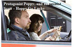 how bleak life can be via use of the antagonist driving instructor, who hates life and is pessimistic by everything, which is emphasised against the protagonist optimist, Poppy, who is almost unnaturally happy for no particular reason, outlined in a scene where she tries to befriend a homeless person and tries to remain happy and make him happy despite having very little reason to be, and the bleak realisation that life is not as nice a place as she thought it to be. The irony of having the bleakness of life illustrated via a comedy is hard hitting. All Or Nothing, 2006, is another film he has produced representing working class families and the typical family life and struggles they undergo. Again, he has incorporated comedic lines to try to almost break the tension in certain scenes. For example, in one showing an argument between a young couple after finding out the girl is pregnant, the boy yells “swear on your mums grave” to which she replies “but she aint dead yet!”


 1. PHOTOSHOP –


1 comments:
Well done everyone for getting the work posted did you get high quality images to Andy?
Post a Comment